4 Months With iOS 7 (Final)
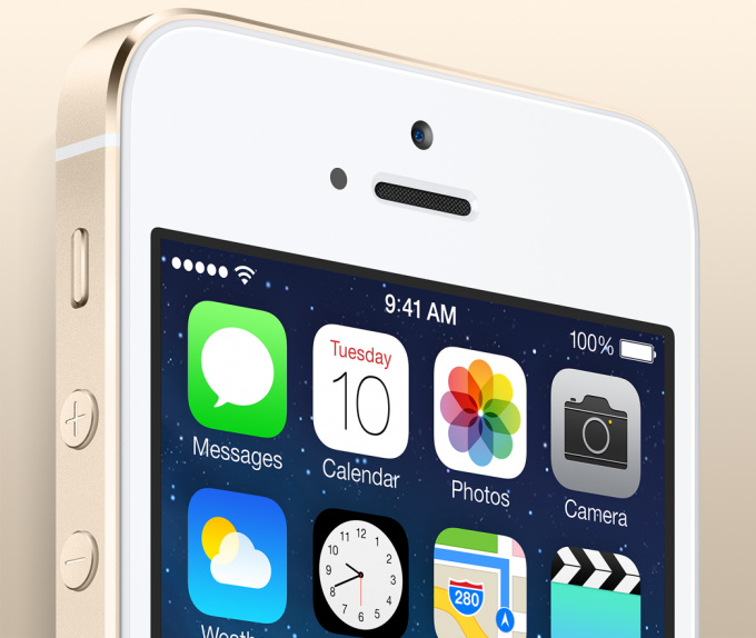
I must say, aesthetically, iOS 7 has grown on me. Installing very buggy developer builds that featured a home screen of clashing iOS 6 and iOS 7 style icons was very jarring, but now that nearly all developers have provided proper updates that fit in with the new polish of iOS 7 there is a lot less to complain about in terms of visual design. I still have qualms about how intuitive iOS 7 is compared to previous versions at a very basic level, but I am no longer a hater. There was a significant amount of progress that happened between the initial June developer preview and the September Gold Master.
I had made a statement in my initial assessment of iOS 7 that it no longer had the refinement and elegance that shined over other mobile operating systems, but I think now it’s clear that it still does. Looking back at iOS 6-style UI elements today just feels old to my eyes. The most promising part of iOS 7 is that it was revealed to be a very short turn-around time to get released, and with a full year between iOS 7 and the next major iteration (iOS 7.1 is more than likely a small feature update and not a major iteration) being iOS 8, it should be exciting to see how it evolves.
Comments are now closed for this article
Let's just pretend that I have proper "Copyright" on this stuff, but when it comes down to it, feel free to use this however you see fit.